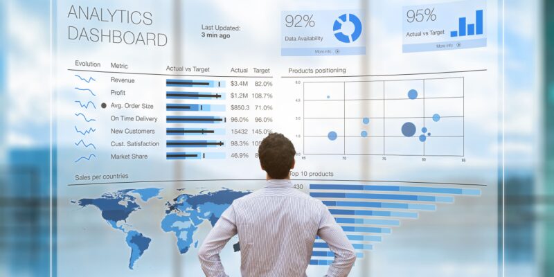
Data visualization is not just about creating pretty charts and graphs; it's an art form that communicates complex information in a simple, engaging, and user-centric way. Whether you are a data scientist, a designer, or someone interested in making data more accessible, understanding the principles of crafting user-centric data visualizations is essential. In this article, we will explore the key aspects of designing effective data visualizations that prioritize the needs and preferences of the users.
Know Your AudienceThe first step in creating user-centric data visualizations is to know your audience. Different audiences have different levels of expertise and interests in the data. Are you designing for data-savvy professionals, or is your target audience the general public? Understanding your audience's background and expectations will guide your design choices.
Choose the Right Visualization TypeNot all data can be effectively conveyed using the same type of visualization. Bar charts, pie charts, line graphs, scatter plots, and heatmaps each have their strengths and weaknesses. Selecting the right visualization type depends on the data you have and the message you want to convey. Consider factors like data distribution, trends, and comparisons when choosing the appropriate format.
Simplify and FocusCluttered visualizations can overwhelm users and make it difficult for them to extract meaningful insights. Simplify your visuals by removing unnecessary elements, labels, or decorations. Focus on the most important data points and use whitespace to create a clean and uncluttered design.
Use Color WiselyColor can be a powerful tool in data visualization, but it should be used judiciously. Choose a color scheme that is easy on the eyes and consider colorblind users. Use color to highlight key points or categories, but avoid overloading your visualization with too many colors, which can lead to confusion.
Provide Context and LabelsUsers need context to understand the significance of the data. Include clear labels, titles, and captions that explain what the visualization represents. Add axis labels, legends, and units of measurement to ensure users can interpret the data accurately.
Interactivity and AccessibilityModern data visualizations often include interactive features that allow users to explore the data further. Implement tooltips, zoom, and filters to enhance the user experience. Additionally, ensure that your visualizations are accessible to individuals with disabilities by providing alternative text and keyboard navigation options.
Test and IterateBefore finalizing your data visualization, gather feedback from your target audience. Conduct usability testing to identify any issues or areas for improvement. Iterate on your design based on user feedback to create a visualization that truly meets the needs of your audience.
Data visualization is a dynamic field that continues to evolve with advancements in technology and design. To craft user-centric data visualizations, it's crucial to stay informed about best practices and adapt to the changing needs of your audience. By prioritizing clarity, simplicity, and user engagement, you can create data visualizations that effectively convey information and drive informed decision-making.


